More pictures!! I wanted to document the before and after pictures of our master bath renovation, though more will come as I document the work being done as well. Hopefully you get some sense of the scope of the renovation.
Here's the "before demo" pic. This bathroom was last renovated in the '70's and it looks like it! Since no one other than LL and I, would see this room, we made it the last one to actually tackle.
Boy am I happy to see this tile go. As you can see, I had started tearing it up before remembering to take pictures!
So here is the corner above the vanity and the pink outline is where the medicine cabinet is in the picture above. Down to the studs!
And this is where the vanity was, just below the medicine cabinet.
This picture is of the wall next to the tub, which we are not replacing. It's fine, so why bother? As in the guest shower, we're putting in permanent shelves (really a niche) in the wall so you don't have to hang anything from the shower head. The shelves are 17" wide by 12" tall.
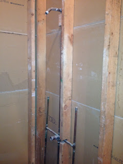
Here's the shower piping. It's going to be raised about a foot or two. I like having the shower head higher and it has worked well in the guest bathroom.
That's it for now. More pictures as progress is being made.
Wednesday, May 16, 2012
Subscribe to:
Post Comments (Atom)


5 comments:
Looks good. Cannot wait to see the finished product. can you link back to some of your earlier renovations?
Sure, here's a link to the guest bathroom beginning.
http://lakeviewcoffeejoe.blogspot.com/2008/01/what-do-you-do-when-youre-illin-rip-up.html
Construction is always good fodder for blog posts.
We did a similar thing a few years ago with our master bath. We kept the tub and sink, but put in all new tile and a Corian vanity. We also put a couple of those shelve/inserts into our shower for shampoos, razors, soap, etc. Best invention EVER.
wow, that bathroom is going down to the bones remodeled!
Post a Comment